Collaboration Projects
COLLABORATION
Winder Gibson Architects has always considered collaboration to be a significant part of our practice. We have participated in many projects with various individuals and firms including out-of-state and up-and-coming architects, artists, contractors, interior designers, event producers and real estate agents and developers. Both in-house and with other parties, we take a team approach to our work, keeping the best interests of the project and the client in mind, working toward a common goal. The projects seen here are the fruits of those collaborations.
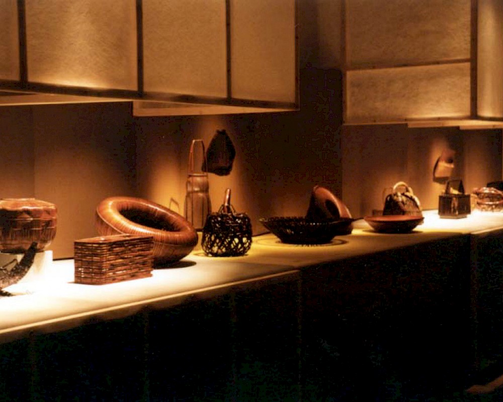
A contemplative space was create at the Asia Society’s Manhattan gallery for the display of ancient and contemporary woven Japanese baskets from the prized Lloyd Cotsen Collection. The play of light/shadow and openness/solidity found in the baskets were echoed in the display architecture. Traditional handcrafted wood carpentry and joinery detailing and contemporary materials such as matt fiberglass were used in conjunction with carefully designed lighting. Collaboration: Professor Marc Treib.

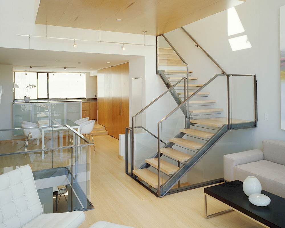
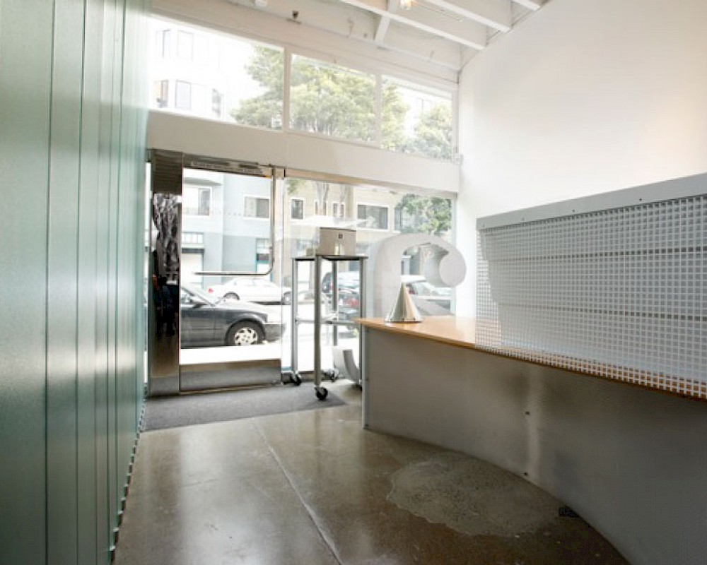
A new home in the Cole Valley neighberhood, innovately reimagining vernacular forms such as the bay window with new materials and proportions elevates the building, pouring light into the interior. Materials include Health ceramic tile, black steel railings, resin stairs and fir ceilings. Project done in collaboration with Addison Strong Design Studio.
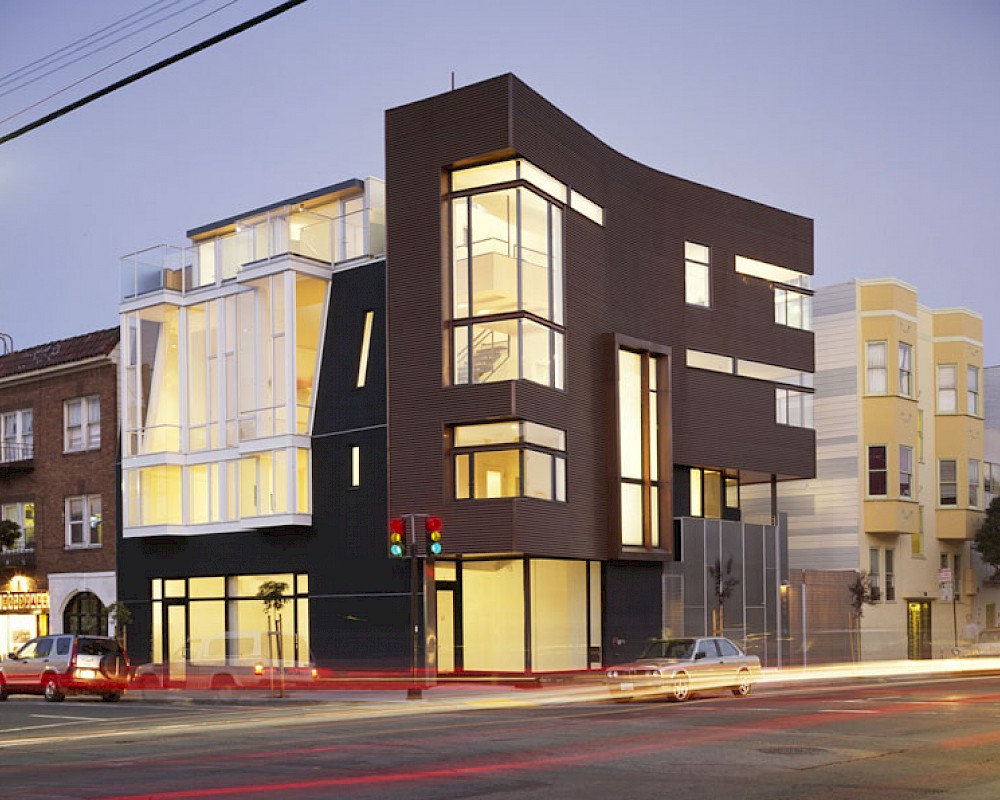
This mixed use development includes ground floor commercial, parking and three residential loft-style units. The residential space is sliced vertically rather than horizontally, with each unit reaching up into the light, looking out across the adjacent rooftops. Located in a rapidly changing corner of the Mission District, the building re-imagines the rhythm and materials of San Francisco low-rise housing, featuring elements such as corrugated copper and frameless glass corners. Collaboration: Kennerly/Strong Design.
This mixed use development includes ground floor commercial, parking and three residential loft-style units. The residential space is sliced vertically rather than horizontally, with each unit reaching up into the light, looking out across the adjacent rooftops. Located in a rapidly changing corner of the Mission District, the building re-imagines the rhythm and materials of San Francisco low-rise housing, featuring elements such as corrugated copper and frameless glass corners. Collaboration: Kennerly/Strong Design.
An interior build-out of a two-level penthouse unit in a prestigious downtown highrise. The design emphasizes the continuity of space for a loft-like environment. Sliding doors transform the unit into discrete rooms as needed. The material palette reinforces this spatial flow: white concrete floors, touch-latch cabinetry, slip-matched walnut paneling and powder-coated steel counters. Whole-house lighting, audio, video and shade controls are all controllable from an iPhone, Collaboration: Joel Sanders Architect, New York.
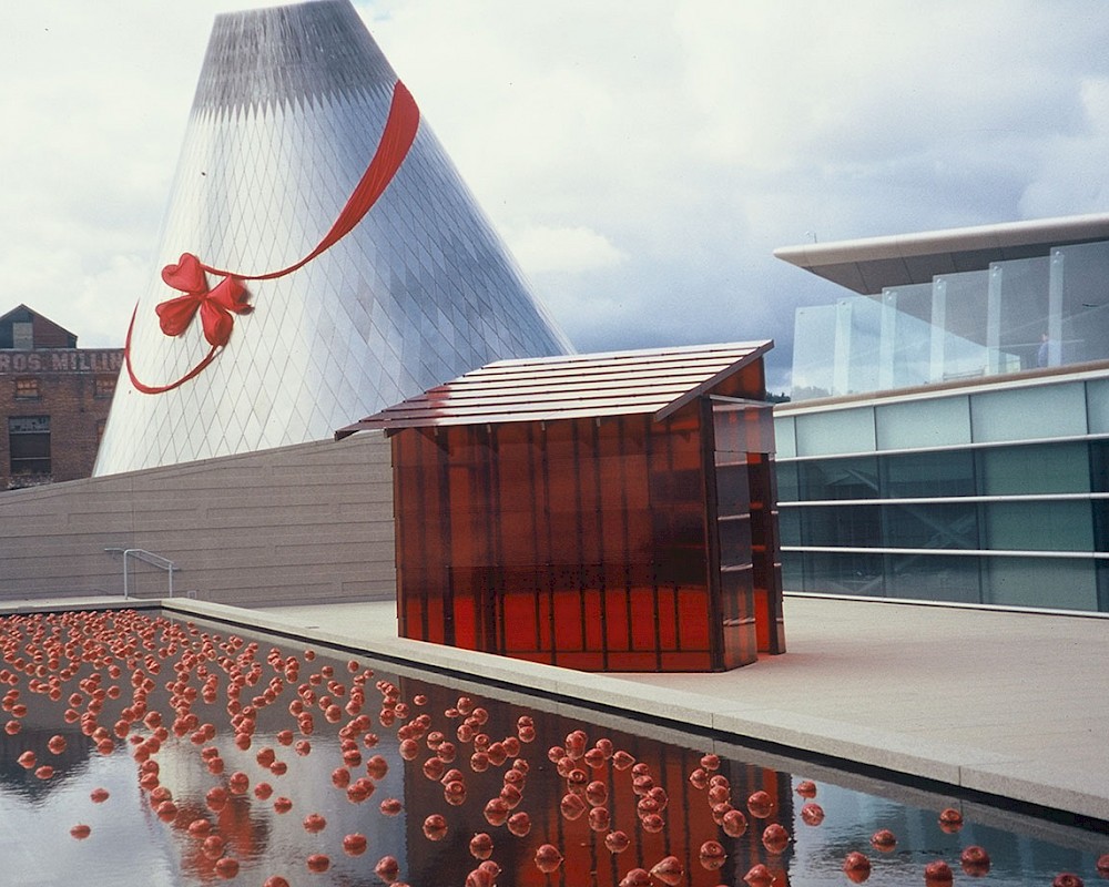
This house of red glass is an installation at Tacoma’s Museum of Glass. It is part of artist Mildred Howard’s series exploring the meaning of dwelling. Here a simple sharecropper’s shack is recast in vivid and luminous color. The theme is the fecundity and beauty of even the most modest house. The house itself is simply constructed. Lapped glass panels rest in custom metal clips. The wood frame is cross-rigged with cables to resist wind and the roof is raised to prevent uplift. Collaboration: Mildred Howard, artist.
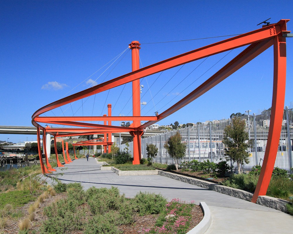
Constructed in a new public park adjacent to Islais Creek, this massive art pieces calls in the ghosts of the Liberty Ships that once docked here. It is hard to imagine this sleepy creek leading out to the San Francisco Bay as a hub of industry and activity during the World Wars. At over 300' long and 50' tall, this sculpture takes on the scale of architecture. And, like architecture, it serve to make a space: a space for leisure and enjoyment but also for memory and contemplation. The steel beams are double-curved to precisely follow the profile and size of the hull of a Liberty Ship and painted International Orange to stand out against the sky. Collaboration: Nobuho Nagasawa.
FLEXIBILITY
While architecture is a social pattern and we seek to tailor a well-fitting architecture to our clients, we also understand that life changes and is unpredictable. Architecture should never be a straightjacket. Just the right fit is needed leaving some breathing room for the unexpected. Can you have a slumberparty for 20 in your living room? When you dim the lights just so, does a candlelit dinner for two feel right in your dining room?
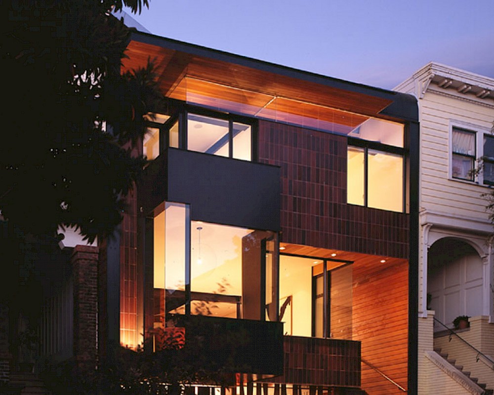
A new home in the Cole Valley neighberhood, innovately reimagining vernacular forms such as the bay window with new materials and proportions elevates the building, pouring light into the interior. Materials include Health ceramic tile, black steel railings, resin stairs and fir ceilings. Project done in collaboration with Addison Strong Design Studio.
HISTORY
We believe in creating an architecture of the present but also believe in maintaining a strong understanding of the past. We work on many historic buildings, carefully deciding where new should look new and where new should build upon and connect with the past. We look to history for examples and inspiration. We don’t believe that contemporary architecture is a style, per se, but rather an attitude that can be realized in many different looks and materials. To mimic the past is disrespectful but to learn from it is beautiful.
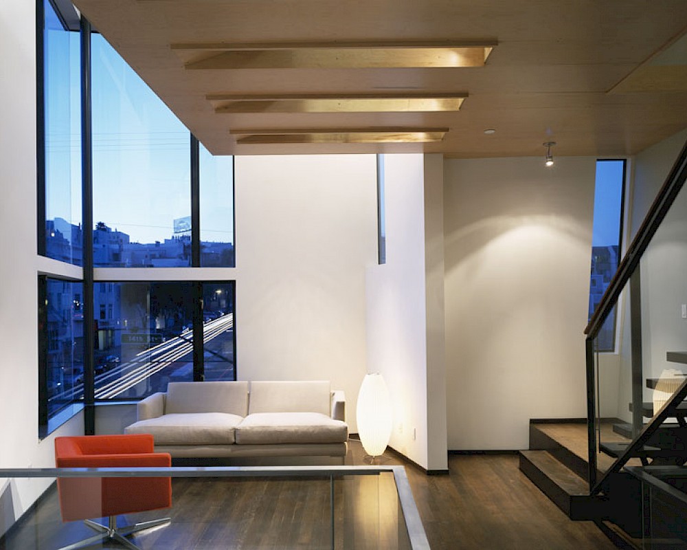
This mixed use development includes ground floor commercial, parking and three residential loft-style units. The residential space is sliced vertically rather than horizontally, with each unit reaching up into the light, looking out across the adjacent rooftops. Located in a rapidly changing corner of the Mission District, the building re-imagines the rhythm and materials of San Francisco low-rise housing, featuring elements such as corrugated copper and frameless glass corners. Collaboration: Kennerly/Strong Design.
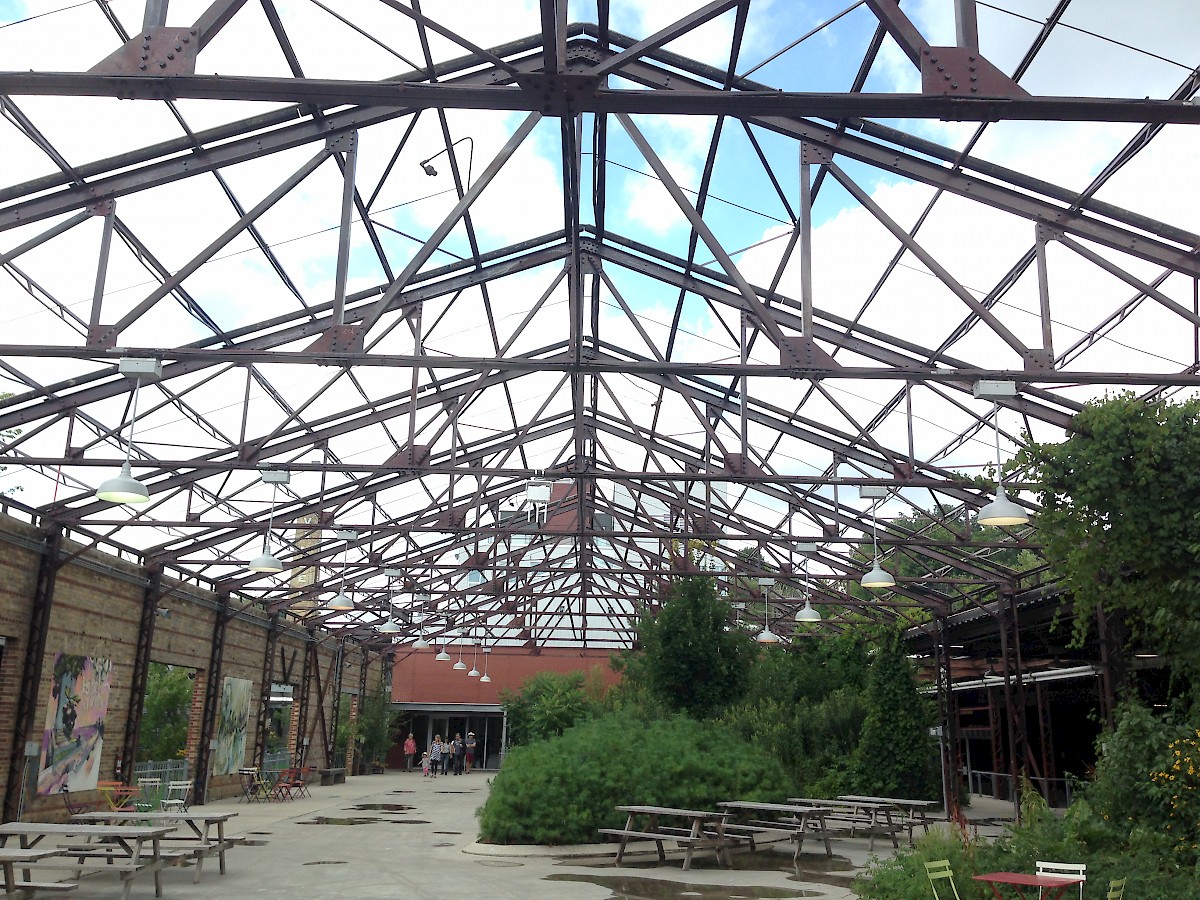
We were invited to design a Sukkah for the Jewish Community Center of San Francisco for their annual fall harvest Sukkot festival. This year, they partnered with the urban-planning think-tank SPUR to hold the festival in an alley downtown, turning the Sukkah into an urban happening and intervention. We designed and assisted in the building of the Sukkah. It is a series of wood slats fixed into a steel base, entirely demountable and flat-packed. Each assembly of the Sukkah can be customized by the team putting in together as an expression of community and adaptability. This is an open architecture.

METAPHOR
Concept and metaphor are almost always present in architecture. These need not be complex or overwrought but do serve to organize and inspire the architecture. We often name parts or elements of our buildings (the saddlebag, the swiss army knife, the barcode in the sky) in order to playfully tease out their character and discuss them with our clients.
Mitchel Mauk is an award-winning exhibit designer, so it was an honor to be selected to work with him on the new offices for his firm. Located in a commercial warehouse space on the edge of the very hip Hayes Valley neighborhood of San Francisco, this bi-level facility plays with transparency and translucency. using contemporary materials such as Profilit glass channels, here held in place with repurposed skateboard wheels. Skylights flood light down through the space for a warm serene environment.
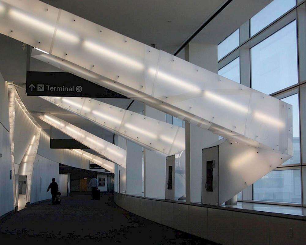
Artists Vito Acconci was commissioned to design an installation for San Francisco Airport’s new International Terminal. His concept was to “freeze” rays of light in mid ricochet as they traveled down a busy passenger corridor. Our firm was selected to help the artist express this vision in built form. The result is a series of steel tubes arrayed with carbon steel standoffs that served both as light mounts and hangers for panels of translucent plexiglass. Collaboration: Vito Acconci. artist.
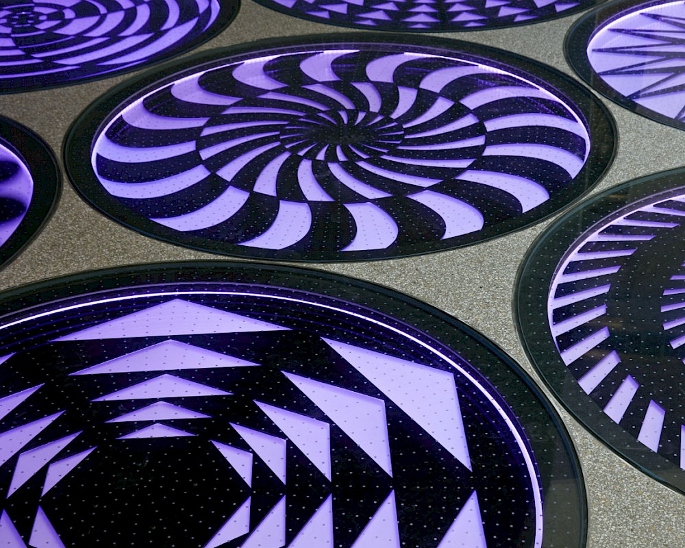
Produced in collaboration with the artist Eric Staller. Installed in a children's play area in the newly revamped Terminal 2 at SFO, this art piece is deceptively simple. As you walk up, your see static 60's psychedelic circular patterns embedded in the floor and wall. The piece senses your presence and they slowly start to spin. As you step on them, they change through a rainbow of different hues, appearing to turn each other like the gears of a giant absurd machine. Making such a simple thing is anything but simple. Textured 1-inch thick laminated glass covers allow us to walk across them and the entire floor of the airport had to be gently sloped upward to allow the hidden sensors and motors to lie below. Their minimalism is their magic.